Code
ggplot(airquality, aes(Temp, Ozone)) +
  geom_point() +
  geom_smooth(method = "loess")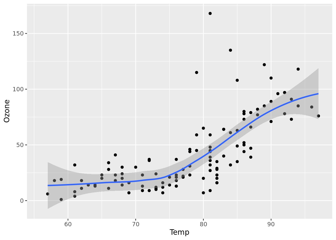
We’re getting married! https://torlakova-molino.com
Figure 1 further explores the impact of temperature on ozone level.
ggplot(airquality, aes(Temp, Ozone)) +
geom_point() +
geom_smooth(method = "loess")This dataset contains a subset of the fuel economy data from the EPA. Specifically, we use the mpg dataset from the ggplot2 package.
Figure 2 shows a positive, strong, and linear relationship between the city and highway mileage of these cars. Additionally, mileage is higher for cars with fewer cylinders.
ggplot(mpg, aes(x = hwy, y = cty, color = cyl)) +
  geom_point(alpha = 0.5, size = 2) +
  scale_color_viridis_c() +
  theme_minimal()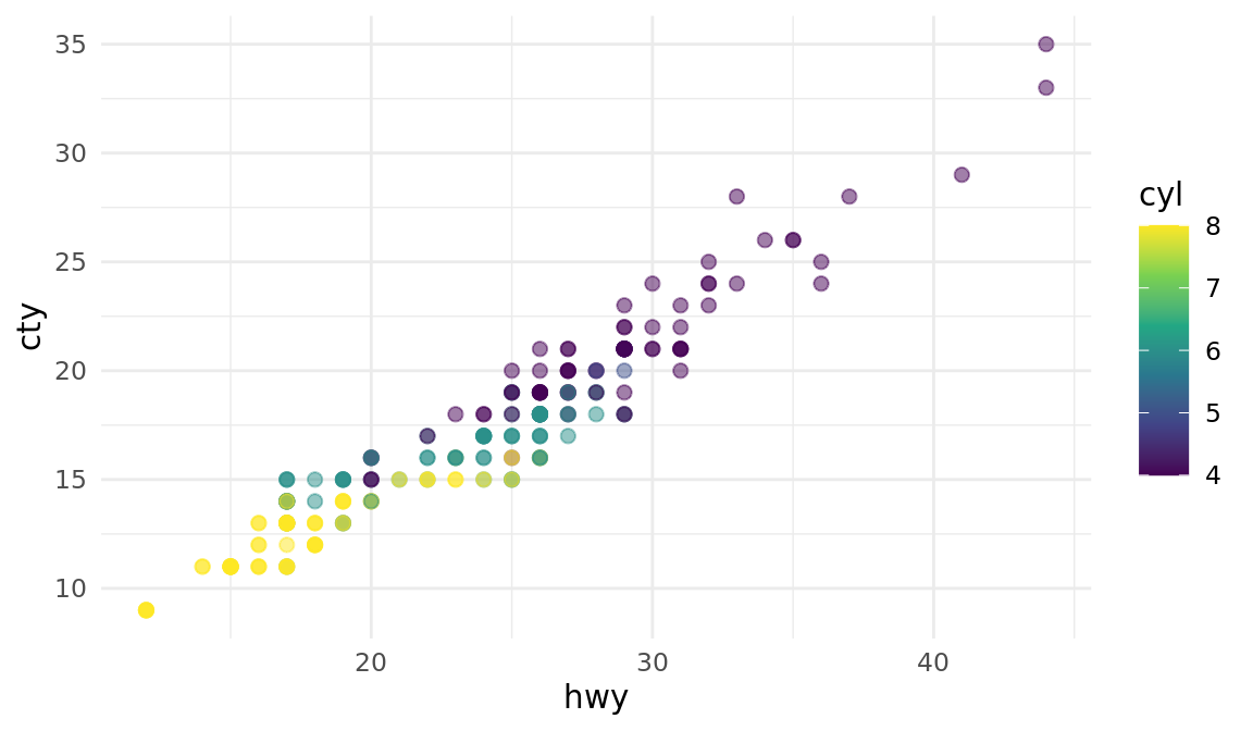
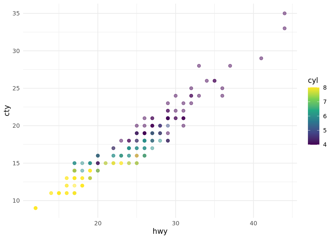
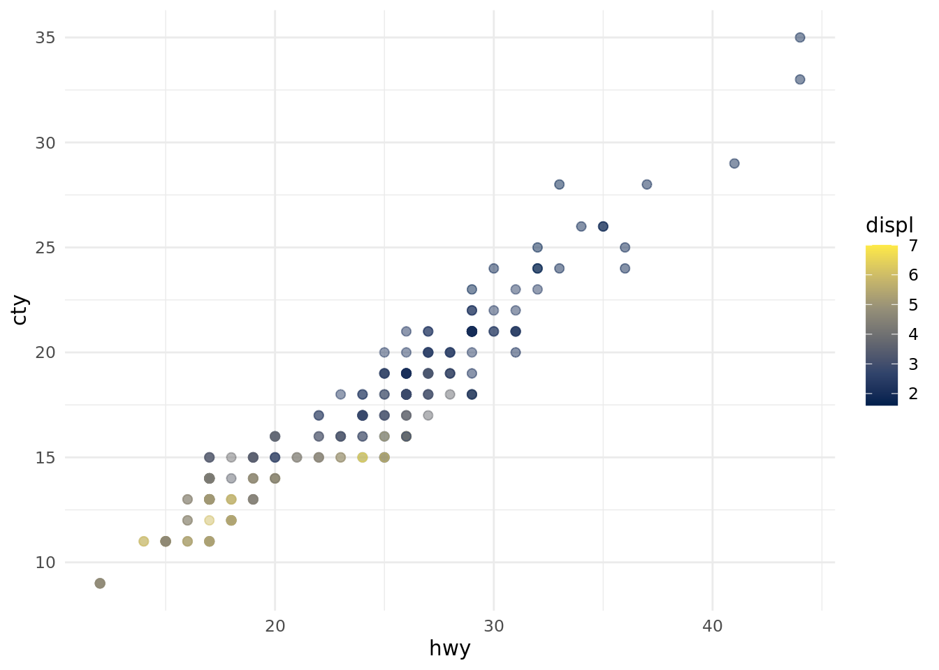
The plots in Figure 3 show the relationship between city and highway mileage for 38 popular models of cars. In Figure 3 (a) the points are colored by the number of cylinders while in Figure 3 (b) the points are colored by engine displacement.
ggplot(mpg, aes(x = hwy, y = cty, color = cyl)) +
  geom_point(alpha = 0.5, size = 2) +
  scale_color_viridis_c() +
  theme_minimal()

ggplot(mpg, aes(x = hwy, y = cty, color = displ)) +
  geom_point(alpha = 0.5, size = 2) +
  scale_color_viridis_c(option = "E") +
  theme_minimal()